Showing posts with label Research Log. Show all posts

Monday, 17 November 2014

Research Log - Jay Maisel

Jay Maisel

Jay Maisel is an American photographer, who studied painting and graphic design before officially becoming a photographer in 1954. He is well know for capturing light, colour and gestures found in everyday like. Maisel has worked with famous individuals such as Marilyn Monroe and Miles Davis. He has also done commercial but decided to stop in order to focus more on his personal work in the late 90s. Most of his pictures portray colour and highlight the different tones which are found in the pictures. Other elements such as form or depth can sometimes be shown in his pictures. After looking into more of his work, I found that most were similar and although the scenes in each picture were different, they still had a few similarities. I find that he uses the same techniques for almost all of his photographs - never failing to capture colour and show the difference between the different shades.


In this picture, the elements of colour an contrast are shown on a rather dramatic scale. The different shades of the colours pink and purple contrast with each other as well as the plane. Another way contrast is shown is through the size of the plane compared to the size of the sky.


The bright yellow field of flowers contrast massively with the dark blue, gloomy sky. They contrast in colour but also in the atmosphere they give off. For example, the field gives off a jolly, summery atmosphere whereas the sky gives off a cold, winter night atmosphere.

A sense of journey is being portrayed in this photograph. Maisel has deliberately captured a dark corridor with light towards the end to show mystery and bring out curiosity from the viewer. The woman is looking directly at the camera, this creates a connection between her and the viewer, almost as if she's inviting the viewer to join her on her 'journey'.


In this photograph, contrast is shown between the buildings as it shows one under construction and one after it has been finished. The element of form is also added as the Sun creates shadows on one of the building's face, showing the 3-Dimensional element of the building.


As I looked at more of Maisel's work, I started to recognise the techniques he uses and I started seeing how he uses the Sun or the sky to make his pictures exciting. Although his work shows great talent, after a while, his photographs became a bit dull - mostly because most of them only show colour, contrast or form. Other elements are portrayed very rarely and even when they are, they aren't emphasised enough. Despite all this, I still think he is a talented photographer and I like the techniques he uses in his work.

I was slightly influenced by his work as I found that the fact he took his pictures on a big scale was fascinating. I really like how he captures contrasts between buildings and in the sky. This is exciting and I would very much like to try this at some point. It would be fun to experiment with the different buildings, differing in sizes, colour, height, etc. I think this brings excitement and thrill to his work, grabbing the viewer's attention and keeping it.


Similarly to Maisel's work, I have used depth to show a sense of journey. I have also captured a scene with light at the end just like Maisel has; this has influenced me and has helped me take an interesting picture as it looks adventurous and shows the theme of journey very clearly. This is exactly what I was trying to achieve and by looking at Maisel's work, I was able to do this.

Overall, Maisel's work is amazing and the techniques he uses to show formal elements are interesting. He has an unusual way of taking photographs but this makes his work unique and exciting to look at. The way colour is expressed is extremely appealing and they have been captured in such a way that it catches the viewer's eye and forces them to look at his work.

Thursday, 23 October 2014

Research Log - Terry Richardson

Terry Richardson

Terry Richardson works with celebrities and is famous for his funky portraits of them. He first started photographing scenes of young people partying along with the New York nightlife before he caught his 'big break'. His use of props, make up and backgrounds all vary, making his pictures even more exciting and fresh for his viewers. One of the things which I found he's really good at is showing the viewer the personality of his subjects. He does this by capturing certain facial expressions on his subjects and by using props, which would add to their facial expression and show off their personality even more. He has also shot campaigns of fashion brands and designers, adding to his fame.


This portrait of Beyonce lacks colour, showing her maturity. The glasses further emphasises this but is then contradicted by her facial expression, suggesting that she's not quite reached adulthood and is still enjoying life.


In this picture, Miley is smoking and this prop has been used so that she is portrayed as a carefree, wild person. This shows her personality and the plain background forces the viewer to concentrate on Miley.


This picture shows Mila Kunis laughing. Once again, a prop is used to highlight her facial features and make the viewer focus on her smile rather than her eyes.


This picture is similar to the ones above but it's still unique. The personality of the subject is portrayed through her clothing and the cigarette in her hand.


As I looked at more and more of his work, I became even more interested in his portraits. Personally, I think they are all extremely original and each portrait matches the person's personality well. His use of facial expressions really helps him to achieve a connection between his viewer and the person in the picture. He makes the viewer feel as if they know the celebrity in the pictures; they know their personality and some viewers may even relate to the portraits, depending what mood is being portrayed. I would like to explore even more of his work and try and apply his techniques to my work when I do portraits.

This photographer has influenced me to a large extent. I am absolutely fascinated with his work and I've fallen in love with his portraiture techniques. I love how he uses facial expression and no more than one prop to show the personality of his main focus. I would love to do more work on this photographer and use him as an example for my work. His white backgrounds are plain yet effective; the viewer has nothing to concentrate on in the picture other than the person.


I have shown these techniques in some of my work. I have tried using facial expressions and a prop to make my subject stand out; this what Richardson does. I think this has worked well for me because this technique has allowed me to create a relationship between the viewer and my main subject. The fact that my subject is looking straight at the camera further adds to this relationship.

In summary, Richardson's work is incredible and although his techniques are repetitive, somehow they still work just as well in each portrait. This may be because of the different moods and emotions each picture gives out, setting the atmosphere for the viewer. They are intimate and can be argued to have one or two similarities to Mapplethorpe's work.

Research Log - Andreas Gursky

Andreas Gursky

Andreas Gursky is a German photographer famous for capturing patterns as well as colour on buildings. Although his main subjects are buildings, he also photographs libraries, grocery stores, etc; places which are colourful or have repetition and therefore create a pattern. Before the 1990s, Gursky did not edit any of his pictures but ever since then, he replies on computers to edit and enhance his pictures. As I was researching his work, I've noticed that he doesn't include any close up of people in his photographs; you can see people in the buildings but that's all. I've also noticed that his pictures are always taken at the same angle. His pictures are all similar when you look at them carefully but the way in which he edits them digitally or manipulates them makes them seem very different.


Like in most of his pictures, this one is portrait and consist of a building creating patterns with its windows and the lights/different rooms showing different colours. This picture also shows tones as we can see the different shades all over the buildings from all the different rooms.


In this picture, the pattern comes from the structure of the building. The different floors create an unusual, curvy pattern, which Gursky has captured beautifully. The light from the skylight creates shadows in the picture, showing the element of form.


This picture is different to a typical one that Gursky would take. Although, the elements of colour and pattern are still being portrayed, the location isn't one he would normally choose however, he saw what this scene could offer and captured it.


This picture is similar to all of his other ones, showing pattern as well as the element of colour. However, this picture in on a larger scale, capturing the whole building instead of just part of it.


Whilst looking at his work, I've discovered a couple of techniques he uses to show off the elements of pattern and colour. The constant use of the same angle brings originality to his pictures and anyone can guess that a picture is his within a few seconds of looking at it; he has a special way of presenting his pictures so that they are unique and contain his 'signature'. However as I looked at more and more of his work, I got bored as they were all fairly similar. The technique used was still interesting but it's being used in every single one of his work.

I haven't really been influenced by this photographer's work. I still think his pictures are good and they have originality but I'm not really impressed because they are all really repetitive and the excitement found in his pictures began to fade away as I looked through more and more of his work. It became too predictable, thus boring. I think his ideas are great but way too similar and if I decided to replicate some of his work, I won't spend too much time on it because I think I may get bored after a while.


I think this picture of mine is fairly similar to Gursky's work. The angle at which the picture is taken at is the same as the one this photographer always uses. Although the pattern shown in my picture is not really similar to Gursky's, it's still a simple manmade pattern, which is what most of his work consists of. Different tones are shown in my picture, which is very similar to his pictures as they always portray a variety of tones.

Overall, Gursky is great at capturing some of the formal elements but the same techniques are being used over and over again. I think his work would be a bit more exciting if he tried using different techniques and maybe change the angle in which his pictures are being taken at as they are all the exact same angle.

Sunday, 28 September 2014

Research Log

Ansel Adams

www.anseladams.com/


Ansel Adams was famous for his black and white photographs, which often portrayed the element of depth and also tone. He is well known for his photographs of mountains and rivers as we can see how well he captures the mystery and wonders that surround nature. I think he will be perfect for future references when we come to look at tone and we look further into the topic of depth.


Lee Towndrow

leetowndrow.com/


These are typical examples of Towndrow's work. He mostly shows off the element of colour and captures form in a variety of ways. Although some of his work does not emphasise the element of colour as much, it is evident that it's still there in the picture. This photographer  be helpful to look at in the future as his work contains a diversity of methods used to highlight the elements of colour as well as form.


Yousuf Karsh

www.karsh.org/


Yousuf Karsh worked on portraits which are all in black and white, resulting in the element of tone being found in every one of his work. In many of his portraits, we can see the different tones on his subjects' faces and the lighting he uses brings this to our attention. However, I don't think I will be referring back to him as we move on to the topic of tone because this element isn't exaggerated enough in his pictures.


Jay Maisel

www.jaymaisel.com/


Reflection is a big focus in Maisel's work. From the pictures above, we can see that he captures the reflection of something that is not necessarily included in the photograph. The reflections portray depth as well as form from some interesting angles. This photographer will be good to look at in the future as I can explore how he manipulates the camera to achieve this.


Robert Capa

www.magnumphotos.com/RobertCapa


Robert Capa's work is based on war and capturing the chaos during this time. Some of his pictures are blurry and unclear like the ones above. This is so that he can put across a sense of danger and panic to the viewers.  This photographer would be ideal to look at when working on the topic of blurring as I'll be able to look at the different intensities of the blurring on each picture.


Annie Leibovitz

www.annieleibovitz.tumblr.com/


Annie Leibovitz is famous for photographing famous people. Most of her pictures are close ups of her subjects, showing off the element of form. The backgrounds in her pictures contrast to the focus, forcing the viewer to only concentrate on what she wants them to. I think it will be interesting to look at more of her work and her method but I don't think any of the elements are shown clearly in her photographs.


Dorothea Lange

www.historyplace.com/unitedstates/lange/


This photographer mostly took pictures during the Depression - this is clear in her pictures as they usually put across feelings of emptiness and desertion. Her photographs mostly show tone but some do explore the element of depth. She normally has a variety of tones in her pictures, making them more appealing to look at. It may be useful to research some of her work in the future when we work on tone.


Florian Ritter

www.pflock.com/


Florian Ritter is good at capturing colour and tone in her photographs. She links the two elements together and highlights each of them when taking photographs. She does this in most of her pictures by showing the viewer different tones of colour. This photographer will be good to refer to in the future as I can learn more about how she achieves the different tones in her pictures.
Kazuha Matsumoto

www.kazuhamatsumoto.com/


This photographer is famous for photographing new designer merchandise. He uses the different elements in his pictures; whether it be patterns, form, colour, or lines. In a lot of his work, he uses two or more elements in one picture - this is interesting because by doing this, he aims to persuade the viewer to get the product in the picture. I think he may be good for future references as he explores all the different elements in his work.


Nicholas Samaras

www.underwater-photography.gr/


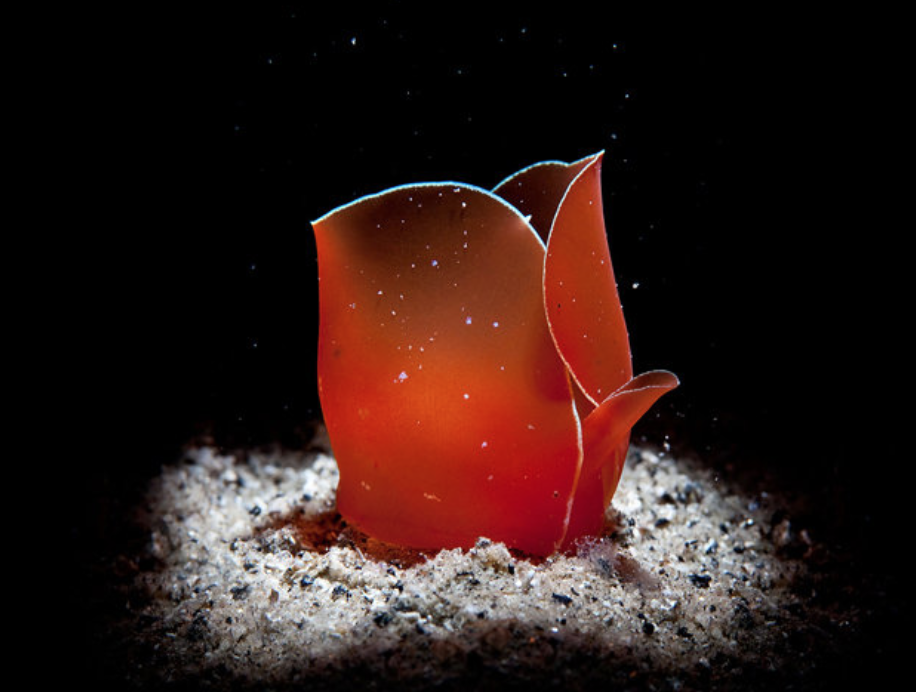
Samaras is an underwater photographer who is well know for his abstracting work. He doesn't have a specific type of pictures but in some of his pictures, the element of colour is portrayed quite dramatically. Because the water is fairly dark, the main focus is always a contrast to the background of his pictures. The subjects are also always bright and colourful so I think Nicholas Samaras will be good to look at in the future.


Jerry Uelsmann

www.uelsmann.net/


These are examples of Ulesmann's work. He uses a variety of techniques to create illusions or to portray the theme of fantasy. In some of his pictures, reflection is the main element. He changes the reflection slightly so that it's different to the real thing. This is just one of the techniques he uses to create illusions. His pictures also show tone as they are mostly in black and white so the different shades in the picture really stand out. I think he may be useful in the future when I look at reflection or tone in more depth as I can use his work as inspiration.


Andre Kertesz

www.atgetphotography.com/The-Photographers/Andre-Kertesz.html


Andre Kertesz mostly shot his photographs in black and white so tone is one of his main elements.
In the pictures above, form and reflection are also shown. His work varies in the elements he portrays and this will be very helpful to me for future references. Kertesz uses shadows in a lot of his pictures and this helps him to show both tone and form all in one picture and these elements are highlighted immensely as he wouldn't normally include a background to distract his viewers, allowing them to only focus on the main subject/s.


Luigi Ghirri

www.matthewmarks.com/new-york/artists/luigi-ghirri/


This photographer shows the element of colour in most of his pictures. He does this by showing
contrast between the colours included in a picture. The pictures above show him using this method. Also,
sometimes he portrays shape but this doesn't apply for all of his pictures. He could potentially be useful
in the future as I could study how he uses contrast and do the same in my 
pictures in order to show colour.


Terry Richardson

www.terryrichardson.com/


Terry Richardson shoots portraits of people. His portraits are in colour and mostly include people posing and making silly faces. His subjects don't normally wear clothes and this makes his portraits more personal and exciting. I think I will be referring to this photographer in the future because I think his portraits are unique and very creative.


Edward Weston

www.edward-weston.com/


This photographer is good at portraying the element of form in his pictures. He mostly does this by capturing objects in black and white and manipulating the lighting so tone is also shown. Personally, I don't think his work is very exciting so I don't think I will be referring to him in the future because all his pictures are quite similar.


Andreas Gursky

http://www.artnet.com/artists/andreas-gursky/


Andreas Gursky portrays patterns in his pictures. Most of his pictures consist of buildings like the ones above. His pictures all include repetition, creating a pattern on a large scale. The backgrounds in his pictures are either limited or not present at all. He does this deliberately to force his viewers to focus on the pattern he's trying to create. This photographer might be useful in the future when I look at pattern in more depth.


Cecil Beaton

http://en.wikipedia.org/wiki/Cecil_Beaton


Cecil Beaton is famous for his portraits of celebrities during his time. Colour was not available at the time so black and white portraits were all he could offer. However, by using props, make up and costumes, he was able to bring life to his portraits and sometimes allowed the viewer to guess the personality or mood of the people in his portraits. He may be useful for future references as I could get inspiration from his use of props in his portraits and maybe apply it to my work.


Brassai

http://www.atgetphotography.com/The-Photographers/BRASSAI.html


Brassai is good at showing the element of tone in his pictures. The use of contrast in his photographs adds to this element as the viewer can see all the different tones present. He is good at picking the correct angle in which to take his pictures so that he can use the light to his advantage and show shadows as well as even more contrast in a particular scene. I might refer to him in the future because I can then explore the different methods he uses to show tone other than manipulating the lighting.


Yuri Yasuda

www.yuriyasuda.com/


Yuri Yasuda is famous for his original portraits. He uses make up and costumes to express what the individual in the picture is feeling. His portraits vary in colour however most of his background are plain like the ones found in the pictures above. I might come back to this photographer in the future when we look at portraits and see how he uses make up on his subjects in his photographs.


Adam Von Mack

www.adamvonmack.com/


This photographer is also really good at portraits and the using make up to achieve his target. However, he uses a lot of different backgrounds to further emphasise the personality of the person in the portrait. His use of make up allows the viewers to focus on the facial features of his subjects. This shows the element of contrast between the subject and the background, which are almost always plain or very simple.